Friday, October 31, 2014

Character Design - finalized design with color exploration


Originally, the characters, if they were to exist in the same world, were too similar so I made the female taller in terms of head size and gave her larger (wider) shoulders. The male was made ultra skinny though that didn't change from the original, however his arms were widened via the clothing. 
Color wise, I think I'm liking 3,4 and maybe 5 for male, and 3 and 4 for female. If they were to be side by side, 3rd male with 4th female or 4th male with possibly 3rd female. 

Influence: Elizabethan Era, but altered. 


Visit to Foreverland - color key #2 (WIP)


After playing around with a couple of different colors, I think these two are the ones I'll be working with. I still need to darken them so it reads as a night scene, but with value and lighting that should read a bit more obvious. 
Disclaimer: Those paintings above on the top are not mine nor do I personally know the artist. They are only for color palette uses.

Thursday, October 30, 2014

Swamp - finalized design with colors & lighting


On the side are the thumbnails I selected elements from to create the finalized design. As part of our assignment, we were to figure out two different colored and lit environments so from my references, I gathered these two color palettes. I'll probably save these two side by side for dA upload. 


Monday, October 27, 2014

Saturday, October 25, 2014

Teens of Valor - "update"

So it's been a long while since I've uploaded a new page! I have been plotting out story points from where I left off though, so the story hasn't disappeared. I just need more time to work on the pages, which is difficult at the moment with the number of hours I need to put into my course work. I might be able to work on rough sketches and page layout tonight or tomorrow though. Some of the details and dialogue needs work so it's not so jumpy/clunky though.

I've started thinking about using Photoshop for the dialogue bubbles instead of Manga Studio. In theory, it should be ok in terms of presentation but I'll have to see how it turns out when I go to try it out.  I apologize for any readers awaiting the next page and hopefully I can speed up the story since the scenes I've been dying to show are still pages away!

Visit to ForeverLand - value edit and color keys


I'm still not quite sure what colors I want some of the objects in the scene but that's what a color key is for , to try out colors right? 
At the moment, I'm leaning towards more of the colors in the 2nd color key. It's a little more...combined, mixed well, what's the word. Those rocks though don't look right with the colored shading for the background though. Too much red and not enough of the green. 

Edited: 10.30.14 7:50 am Pacific Time
I decided to change the 2nd color key so there weren't more than one contrasting color. The purple is still ify on me though. 

Wednesday, October 22, 2014

Variations of ideas

Both my Digital Media II class and Visual Development I class share a common point of variation for this week's assignment. In Dig. Media II, we're starting out final projects this week with thumbnails of our environments.  Can you guess the environment I picked? Hopefully I zoomed out far enough to be acceptable for what the instructor wanted in terms of distance. 

Below are the number of images I pulled from Google Images and deviantART as reference and inspiration, respectively. I'm starting to gather more of these reference sheets, and saving copies on my external hard drive, which is a very good thing!

In my Vis Dev 1 class, 2 of our silhouettes from last week are put under the variation lens as we're to do 5 variations of them. 


Edit of fictional event poster


It turns out the values were much too close to each other between the pumpkin, laser/lazer guns and the hands. Additionally, the title text and secondary (when, where, what/description) were too much work on the part of the reader to read, so those got changed. Third tier text (extra info, cost) was bumped up in size.

If I had more time, I would have carved the title into the pumpkin and changed the hands to show more that it's a *Halloween costume* lazer tag event.

Friday, October 17, 2014

Final layout linework & value, possibly


Part of our assignment for my Inspirational Art for Animation class, we had to detail out/finalize our line work as well as our tonal painting of it with lighting. The tonal has to hold up without the lines, which I think it does for the most part?

The latter part of our assignment this week is to color our character designs. Thank goodness we don't have to render the characters all out. (aka, cell shading is fine.) Detailing the rest of the linework and applying those values and making sure they held up without the linework took possibly 10-11 hours. I honestly can't recall when I started but I think it was around noon and I finished recently (around 11 some odd pm.) I don't even know when I started the tonal part since as soon as I finished the remaining line work, I went straight into values. 

Wednesday, October 15, 2014

Fictional Event poster and Character Shapes & Silhouettes

So last week's Digital Media II assignment was to design 6 thumbnails for a fictional event poster, of which I came up with the idea of a Halloween Costume lazer tag event. This week , we were to color it and finalize it as a colored poster or flyer, with information with the proper visual hierarchy. 


In my Visual Development 1 class, this week we're moving onto characters, which means shapes and silhouettes for homework. 


Monday, October 13, 2014

Saturday, October 11, 2014

Costume Carnival - International Ghost Convention theme for costumes

Ranging from 10 - 20 mins. 

15 mins 

10 mins

20-25 mins

~20 mins

20 mins

10 mins

10 mins

10-15mins

10-15 mins

Character Redesign WIP6

I'm still fixing arms, legs, feet placement for these characters. Croc-Croc's turnaround needed to be simplified but I don't know how simplified is good enough. I've added some curves and straight lines for arms. Hook's head had to be enlarged to fit in with Peter and Tink, and that meant his body had to scale with his new head as well, otherwise, it looks too much like a bobble head to me. 


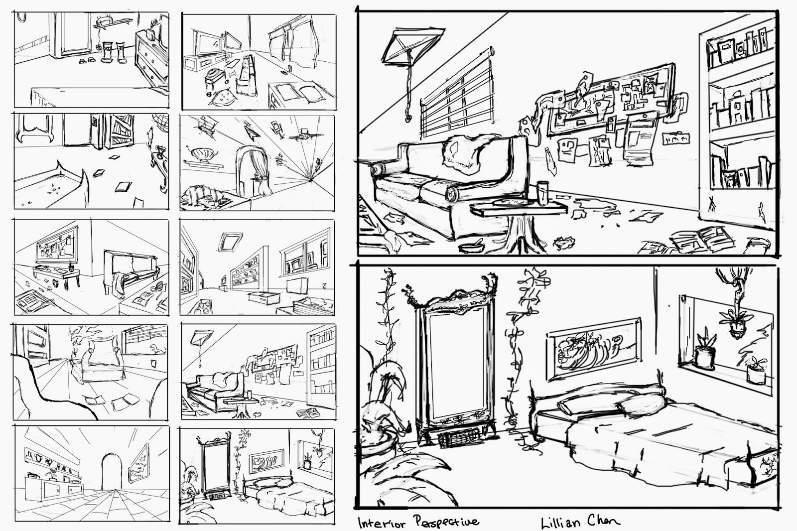
Interior Perspective Thumbnails


For our assignment, we had to draw 10 thumbnails with interior perspective and pick 2 of the 10 to bring more details into. Some of my thumbs were ok-ish but lacked story or details to tell what kind of person was living in the room. 

Tuesday, October 7, 2014

Character redesign WIP 5

Construction lines. 
Added or edited turnarounds, added or edited hands.