Showing posts with label illustration. Show all posts

Friday, December 27, 2019

Been a very busy year!

Since my last post, almost a year ago (oh..!) :
  • Bugology, the  was released on Google Play
  • I got a part time job at a retail store, 
  • started, and finished [the art], on another game for the group 
  • went to Lightbox Expo's 1st expo! Made a ton of new art friends and went to a lot of talks
  • experienced Black Friday shopping as a worker, and as a shopper; also experienced Christmas Eve shopping as a worker
  • finally did some fanart of RWBY
  • worked on anatomy through the fanart 
  • discovered I need to work on shadow shapes more
  • reorganized my Pinterest poses board with subcategories 


Cenote Xlacah illustration done for Rune Master, for the startup indie group I joined last Aug. 

Queen's Throne Room, personal piece 

Team RWBY, personal piece/ fanart 

Ren, personal piece/fanart 

Jaune, personal piece/fanart 

Nora, personal piece/fanart 


Sunday, January 13, 2019

Scout Astor Hummel - prop and character design

Kappack (backpack prop) - Ortho


Scout Astor Hummel - character design illustration 
initial sketch of Astor Hummel character design 

Friday, November 30, 2018

Bugology - a large milestone

Back in August, a developer reached out to me to join his game making group, as an artist. After many bumps, the group has finally released its tester (demo) version today!


Backyard Insects - paintings

Backyard background painting 

Backyard background painting, with objects placed in. The wood pile ended up being repainted by our second artist due to initial roles of me, as the background painter, and the second artist as the character (insects) and objects painter. Due to balancing issues, the objects painter role got sent back to me, haha. 

Bugology game logo, version 3. 

Logo sketches. Client ended up liking two images, one as the logo and the other, the client selected as the game's icon. 


There ended up being quite a few designs I went through when designing the logo. 

From the selected logos, I went through many iterations. 

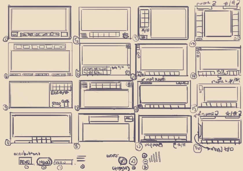
But of course, there were ideas, paintings and assets that were unused, such as the original game user interface design I had designed, sketched, created parts for and mocked up. 


Sketches of the GUI for client

Mockup of GUI for client / developer to build. Our group's third developer voiced out that this setup would cause a lot of lost space, and tiny assets,  to which I agreed. 

The main menu (settings) UI design, the client wanted me to design for, also got unused. Or at least the main game menu that is released with the testers (demo) version, is using a simple version. 

Other unused assets and ideas included buttons and Login/ Create Account screens. 
  
 
Unused Create Account/ Login mockups. 


Bug Book UI mockup, version 1.1

The Bug Book mockup stayed unchanged mostly from the version 1.0; just color changes, and removal of clients' side arrows to be replaced with folded pages. 


Saturday, September 15, 2018

Playing with a different style for environment drawings

I wanted to try changing my painting style to something more solid, less loose. A lot of my early paintings could be considered pretty muddy with the paint so I purposefully painted in flats and worked up from there. 
The kitchen illustration was actually the first set of the three, where I focused on values and story telling. Going from there, I had a personal success with the Greenhouse, in the style. And the Study Room was a second test to repeat that same style. 
Personally, I like the Greenhouse's results best; I feel like with the Study Room, the color palette was the best result out of it but I didn't get the same clean look I got from the Greenhouse piece. 
Moving forward, I definitely plan on working on this style!

Greenhouse 

Greenhouse - initial sketch 
super messy thumbnails for Greenhouse composition

Kitchen - initial sketch

Kitchen - rough values


Study room  - comp thumbs


Study room - initial sketch (rough)

Study room - sketch version 2 (cleaner)

Study room - rough paint in, pre version 2 sketch.

Study room 


Monday, July 30, 2018

Vehicle and character design pairing


As a challenge prompt from a Facebook artists' group, I designed a character and vehicle. It was definitely something new where I had to consciously make something look damaged, as the prompt involved an escapee and their get away vehicle. 


For the character design, I wanted to challenge myself with making an armored character, and began sketching helmet designs. Once I found a couple I liked, I began working on the full character silhouette. 


The initial character sheet's layout started pretty much as above, with the character's illustration on the side. 

Eventually, I decided the back light beam was too much and took it off, and began working on the character's lighting. 

After taking away the line drawing underneath, and cleaning up some areas, I changed the layout after receiving some construct critiques on the model portion of the sheet, and hard edge indications. 

During these edits and changes, I was also working on the vehicle design along side the character, progressing at the same time. 


 There were tons of thumbs I went through as I was figuring out what to use as a design.


My idea was to have a small ship, one that wouldn't take a large crew to fly, especially since the character was escaping, and most likely had little to no time to get a crew.  Design wise, I also wanted the ship to hold some similarities to the character. The two tails on the back were part of that design. 


The damages I envisioned were from ramming into objects during the escape, with bullet holes from people trying to stop the character from escaping.  The main section that had the bullet holes was the cockpit area, as the guns were aimed at the character. Another area I thought about was the crew area, where the smaller windows were, but the windows were too small and might have made the holes unreadable. 


I then decided that the piece where the smaller windows were was too messy so I brought the paint back and thought about indents above that section of the ship. However, in the end, it didn't make sense with the shape of the ship, and I couldn't think of a logical way for the damage to end up there. 


Similarly, I scaled down some of the other damages on the ship, and cleaned up the orthographic drawing. 


Towards the end of this challenge, I caught myself more on the lack of hard edges when I was painting, which was good, now that I could catch myself on it. Going forward, I definitely need to use hard edges more, or at least, while I'm painting, jump back and forth from hard edges and soft. 


Friday, July 6, 2018

Market Street

Market Street


presentation sheet

There was an art challenge contest (THU 2018 Golden Ticket Challenge) going on, on ArtStation during most of the month of June, where artists had to create a painting of a parallel magical world of Malta.
I wanted to test myself, to see how much I could grow while participating in this challenge, and to see how I would paint a fantasy piece.

During the research and thumbnail phase, I had several ideas of what I wanted for the composition. Ideas ranged from knight statues guarding gates, rivers leading into the city, multiple bridges and towers. The latter idea eventually spawned into the current piece as I really liked how I could add a lot of range in the environment.
research notes and thumbs
sketch on top of phone rough sketch

From there, I knew I wanted a warm color palette, something to add to the fun of the piece. 

flat colors

shadow and some lighting

building and building


I kept building and building the mini world I had created.
Eventually, after having hit a wall on what else I needed to work on, oh the down side of working on a piece for a while!, I asked in various social media artist groups for their opinions and received good critiques from a number of people.

(Before)  ---  Oh perspective fixes.--- (After) 

Hard edges and wonky perspective were the two main things I definitely found myself working on and correcting throughout the piece.

Punched up the values, added in the lighter values I was missing

Pushed back background to bring out foreground
I also got little bits of feedback that really helped me push the piece, such as missing the last 15-30% of lighter values in focal area, and pushing back the background to bring the foreground more into focus.

There were a ton more progress shots but for the sake of the people scrolling , I kept the images down to a minimum. Or at least I hope so!

All in all, I really improved in my painting skills and got to add another genre experience onto my belt.Now I just need to bring the knowledge in earlier into a piece, and try to cut down my finish time.
I had to take break the whole process into a lot of 3 hours sessions to keep my hand muscles from overwork/overuse, and to keep my laptop from heating up due to high temperatures while I was in Taiwan during the process.