Showing posts with label prop design. Show all posts

Sunday, January 13, 2019

Scout Astor Hummel - prop and character design

Kappack (backpack prop) - Ortho


Scout Astor Hummel - character design illustration 
initial sketch of Astor Hummel character design 

Wednesday, December 19, 2018

Redesign & paint of Queen Crystallos & Diana Lang

In telling myself I needed to draw more orthos, I revisited some old character designs and selected out some props. The props I knew I wanted to draw were from the Visual Development for Live Action course I took while at AAU. During the course, there wasn't really a prop design requirement; just 4 characters (hero, sidekick, villain, creature) , vehicle and environment. 

The first prop I tackled was Queen Crystallos' scepter. 


I knew there was gonna be quite a few details I had to figure out while I was drawing the orthos, but it was a worthwhile challenge. 

From there, I decided to revisit the old character design of the Queen and redraw and redesign the character. The old painting, while for live action, was pretty blotchy in the paint, and it bugged me for years. 


For the redesign/draw/paint, I went and tried a line based approach and added a lot more detail to her dress, and completely redesigned her crown. The old one looked rusted, which wasn't what I wanted,  and bone-like, which while does work for villains, was also not what I wanted. 

After I completed the Queen, I told myself I might as well redesign/draw/paint all of the remaining characters and create orthos for their props as well. 

Thus, the heroine, Warrior Diana Lang. 


Her style ended up being something very different from the style I went with for the Queen. (I intend to go back and repaint the Queen in the same style as the Warrior.) 


The retractable shield gauntlet changed quite a bit from the original design. I actually couldn't recall what the original one looked like and this version was a happy accident while I was painting the new character painting. 


So far, I really like the style I went with for Diana Lang, and her shield gauntlet. Onto her sword! 


Friday, June 1, 2018

Research Sub R2 (vehicle design)


presentation sheet with orthographic and some original thumbnails


This was the original thumbnail sketch I took and blew up to start filling up spaces. I added railings for stability once the sub returned to the main ship for docking. I also added many, many lights and windows. 

I told myself that if I wanted to have a cleaner painting, I needed to create a good line drawing. I still hate making a super clean line drawing since it always look stiff afterwards but I kept the lines as clean as possible before going back and filling in a flat value for the silhouette. 


From there, the purple background wasn't dark enough for me to see any loose paint lines so I filled in with a nearly black. (It's actually a really desaturated dark blue.)
And from there, once I filled in a solid single value for silhouette purposes, I started actually painting in the value differences while keeping things very desaturated and monochromatic to avoid going too crazy on colors early. I found at times, I tend to pick too many colors at once and it gets crazy quick. 


Once the solid values were in place, I started painting in shadow and light. After that, I started using the  soft light  blending mode for the brush and adding in colors to see what looked nice together. I wanted to keep yellow as a primary so I tried various oranges and purples but the purple I had picked looked odd for a submarine color scheme. I threw on the purple and then started playing with the Color Balance layer adjustment to find a good mix I wanted. I went towards a warm magenta orange-yellow balance. Once that was in place, I painted in the highlights and eventually wear and dirt/rust. 

It was a nice change of pace to actually draw the cleaner line, rather than my usual loose sketch - paint over method. I also separated the layers more than I would usually, something I started implementing during the #mermay art challenge drawings. It definitely helped keep things within the silhouette and also allowed me to keep each blending mode on its own which let me keep things organized in a different but helpful way. Particularly the soft light layer painting could be kept away from the overlays and the color dodge and extra highlights could be on their own. 


Friday, March 9, 2018

Retractable Shield - prop design

Prop design for Retractable Shield

In an older character design, I had thought up of this shield design in the thumbnail stages but never featured it. (I don't know why I didn't since it would have made the character more interesting.)
Hindsight is 20/20, haha!

The original feature of the shield was in its retracted state. I regretted the fact I never painted it in its extended state and been telling myself to make a prop sheet of the shield since then. 


I wanted to test out how keeping the lines would work for painting, since I usually get rid of the lines during the painting process after I get the main shapes in. 

Sadly, I still need to work how I layout prop designs since it's not as appealing as I'd like. I've seen some very nice looking layouts for weapon designs and definitely want to get to that clean layout with a good level of finish. Going forward, it's a goal I aim to reach!

Tuesday, January 23, 2018

Daikon Inspired Lamp Designs


During a long grocery run (many stores, far distances), I spotted some uniquely shaped Daikons Daikon Green according to the store's tag, which makes sense since they were dark green small daikon. The daikon I grew up seeing were the long white radish types, so these smaller and spherical shaped ones were new to me. 


Going forward from my sketches, both of direct studies and stylized shapes, I took one of the direct study sketch, as it made me consider lamp prop designs, and went from there. Somewhere along my sketches, in my sketchbook, I thought about paper lanterns and the idea grew into Japanese paper lantern lamps. 

From there, I played with shapes, dimensions, and designs of the lanterns while also playing with the shapes and dimensions of the base (which was based off of the selected daikon shape). 

For the colors, I originally thought about the standard cream white /yellow paper with light brown thin wood, but then wondered, what if there were other colors? As part of my experiment with digital watercolor brushes, I really tried seeing what colors worked together and played with blending. 

I'll have to play with digital watercolor brushes more, especially in a full painting situation but I do like how nicely they blend. The only thing that I might have to work on is, how to add contrast through value rather than colors; blacks and darks don't seem to register. 

Tuesday, January 16, 2018

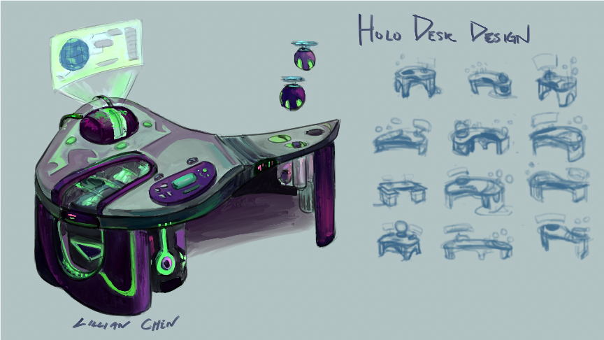
Holo Desk and Drone design


I wanted to completely redesign an old desk I drew for my comic, Teens of Valor, since I found the old drawing lackluster and not as sci-fi as I wanted. 

The first drawing is actually pretty close to the first thumbnail, which, looking back, had such an unappealing shape design to it. In effort to make the desk more sci and add unique shapes into the design, I spent quite a bit of time thumbnailing ideas. 

I got some neat silhouettes out of the thumbnail process and picked a few for presentation sake, before moving towards the sketch and linework phase.

When I got to the color phase, I realized I default to greys and blues often for sci-fi props, and subconsciously wondered if I was trying to work in gray scale. 
When the happy accident of adding dark purple to the colors occurred, I wondered, what if I made the color palette dark tones?

This lead me to consider the presented color palette. Story wise, for the comic, I'm a bit unsure about using darks for the props as it belongs to the heroes' headquarters, but who said darks had to be 'evil'? To combat this color correlation, I added in some pinks on the purple and tried using warmer colors for certain parts. 

All in all, it was pretty fun to see the progress the shapes took from thumbnail to thumbnail and I really had to think about why certain parts would go where. 
Also, I get to draw a prop design presentation for the drones from the desk! In hindsight, I wish I designed those first...


During the thumbnail stage, I went through a large page of thumbnails before figuring out features, placements and things such as stability. 


Thursday, January 11, 2018

House Plants

Influenced by my recent trip to nurseries, I decided to paint house plants.

First up was pothos!

Then cacti.


And succulents.


It was a ton of fun painting these since I got to design plant gardens. Cacti and succulents were particularly fun with all the color possibilities, though because of that, I had to really choose my colors while I was painting. 

I never really knew there would be so many mini cacti and succulent garden possibilities before I started this mini prop design project. It was definitely a nice study project as well. 


Saturday, January 6, 2018

Regal Chair design


Starting out, a lot of the chairs were really rigid when I was sketching them. From there, I was really able to break out of the stocky shapes, which I was really glad about. 


Wednesday, January 3, 2018

Reign of Ice - Queen Crystallos' Scepter

Prop call out


Finding myself lacking in prop design work, I decided to take the Queen's scepter from my "Reign of Ice" project and create a prop design page.

For reference purposes, I made the top portion of the scepter due to how organic the shapes were. 

Originally, the design was something like this, but then I didn't like how similar the crystals looked in shape, so I changed it up. 

From there, I built up the scepter and adjusted along the way in terms of contrast and details.
In the end, due to the number of callouts, I decided to make a separate page for purely the callouts and textures. 


It was definitely a struggle to create the top wood piece of the scepter in Sculptris but it was worth the learning challenge. I was able to discover how to make shapes and pieces rather than faces. Eventually, I will try to learn how to lower the poly (triangle) count, haha. 


Friday, December 21, 2012

Lady Ribbon's Sword - part 8 (finished)

highlights added on -  Linear Dodge (Add) layer at 70%, brush at 30% highlights added on - Linear Dodge (Add) layer at 70%, brush at 30%

12:44 am EST

Lady Ribbon's Sword - part 7 (colors part 3)

fix ups, thinning outlines, painting over line work fix ups, thinning outlines, painting over line work

11:48 pm EST

[Partially] painting over the line work the line work takes more time than I always expect, then again, I was zoomed in more rather than working on it zoomed out.

Before the painting over line work layer, I had to go back and make a fix up layer to fill in any spots I didn't cover during the base or shading layers.

Both fix up and painting over layers were in Normal Mode 100% but I played around with 50% and 70% opacity for the Airbrush Opacity Flow (default brush) and obviously changed brush sizes.

I should make a new group one day for that brush for different sizes that way I don't have to manually change it every time and can just quick select  or use the key shortcuts.

Lady Ribbon's Sword - part 6 (more colors)

1st layer of shading, done! 1st layer of shading, done!

9:42 pm EST

Finished first layer of shading - I don't know when I started exactly, for the second part of shading, but at most an hour considering when I came back from dinner.

Lady Ribbon's Sword - part 5 (colors part1)

some of the shading done. Currently set as a normal layer (100%) some of the shading done. Currently set as a normal layer (100%)

6:38 pm EST

Some progress so far as I fixed up the values (somewhat minor so I'm not reuploading the new values layer). I did have to change the background color so I could tell what was already shaded in terms of values (gray background + gray values = not such a great idea).

The right sword is more complete if anything; I'm still finishing up the left sword.

Thursday, December 20, 2012

Lady Ribbon's Sword - part 4 (base colors)

2:14 pm EST

I would have had this up sooner, but I got distracted by an online  game!

I couldn't decide what layer mode to put this on; soft light would have been my usual choice but the colors were too opaque. Maybe I'll go back and play around with the opacity of the layer while using Soft Light mode.

base colors on Hard Light mode base colors on Hard Light mode


/edit Nope, Soft Light at lower opacity level settings is worse than at 100%.

Lady Ribbon's Sword - part 3 (line, re-values)

12:50 pm EST

linework linework

redo on Values redo on Values

Friday, November 16, 2012

Lady Ribbon's Sword - part 2 (Values)

1:03 AM EST


Nope, I lied to myself and ended up deciding to finish up the last two values.

Rough values for the sword

rough values