Monday, April 30, 2018

Mountain Cathedral


For this round's matte painting, I took a slightly different approach with the piece. In the Haven City matte painting, I had a rough value setup below the photos, and searched for pieces of the painting. In this piece, I found photos that worked with the idea of the piece, after having browsed through various saved pins on Pinterest, and threw them onto the canvas to see what I could do with them. 
The idea came to me after looking at saved pins of mountains before I thought about a What If scenario, of a cathedral up in the mountains, instead of a temple, which seemed pretty common in movies. 


Once I figured out placement, I began sketching in between, over and connecting the photos. 
None of the photos are mine so I can't take any credit for taking the photos. Unfortunately, I don't know who to credit for them either. 

Once the sketch lines were placed in, and I got a general idea of the piece, I started painting to fill in the gaps, before moving onto the cathedral. 

... then working on the bridge, hiker (which I also gathered photos for, though from Google). 
Obviously, without changing the hiker's details and pose, it would be a direct copy paste, which I wanted to avoid, for plagiarizing and taking other people's art (painting and photography). 
What you see above though, is not the original hiker image, since I already started changing details at this stage. 


Friday, April 27, 2018

Common Room - Teens of Valor environment design

Bloom lighting can be so pretty~

In the thumbnail stage, I told myself I really wanted to feature the kitchen bar counter piece more than the rest of the kitchen and show part of the living room space behind in the background. 
Another feature I really wanted to include was the staircase that didn't completely touch the floor. 

In the sketch portion, I decided to use multiple colors to help me see a bit better in my own drawing, especially since I started the sketch with everything as if it was transparent by drawing all sides of each object. 

The color stage was where I chose to paint differently. Usually I go right into painting very messy (well, not as clean at least), and include the shadows and lights on the same layer. This meant I would go straight away into painting and rendering. Thinking back now, I think this caused a lot of contrast-less paintings. 

To change that, I decided to make each shadow, secondary shadow, natural (or artificial) light , reflective light and bounce light, and bloom light on their own layers. 

It helped me adjust values better since I could go to the specific layer and change opacity or contrast on that layer and that layer alone. I think this method even let me get certain bounce color lighting better than I would if I had painted it in on the same layer, which helped me with this piece as I had colored transparent walls that needed a lot of bounce lighting. 


While stylistically, it's different than what I usually paint (no sketch lines, somewhat painterly style), it was a nice change of pace and I definitely want to see if I can incorporate it with my usual style. 
On Twitter, from one of the artists I follow, I saw some really lovely line work that I want to try to emulate for my own piece. The lines weren't like mine, where the lines were contrast and hard/harsh. The artist's lines were soft and sectioned; of course the said artist's style is watercolor so it complimented well. More experimenting ahead !

Communications Room - Teens of Valor room design


composition thumbnails  as well as some prop thumbnailing/sketches
The initial sketch of the environment was rough at first before I went over the same sketch layer and thickened certain lines to indicate what was in front of the other lines. 
It's still not a clean line work; I've found myself never really liking the clean line art since it loses the feeling it had as a sketch.

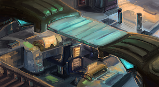
When I first started adding in the colors, and adding in some of the material details on the glass top piece, I envisioned a clear glass piece, until I saw some photos on Pinterest that showed frosted glass pieces, from some glass staircases. This made me consider frosted glass, since if A) the glass piece was to be walkable, which the design was initially, the glass had to be thick enough not to crack under various weights. The staircase design I saw had two pieces of glass with extra piece of metal possibly in between the two, which looked a lot sturdier than one clear glass piece. 


After making that slight material change, I added in an orange rim light to most of the environment, which was casted from the orange computer screens and the hallway light on the far right of the image. Since the hallway light was farther, I made that orange a bit softer than compared to the computer screen light's rim lighting. 
Ultimately, as usual, I got rid of the sketch lines and started cleaning up the paint. 

Not long after, I started painting in lived in details, such as drinks, cans, opened snacks. However, even after adjusting the color balance and such, I still felt like I was missing lived in details. The piece wasn't as void as it was initially but the snacks and cans were very small differences in the environment. And since this Communications Room was a public space, I couldn't really just throw in clothes draped everywhere like you would see in a bedroom or a walk-in closet. 

While I did include some lived in details like empty cans and opened snacks, I found myself still wondering what else I could include to give the environment a lived in look. 

I even opted to study and try to create my own computer box designs.


However, in the end, I kept this piece a Work In Progress as I'm not satisfied with the result just yet. A reason I could be unhappy with the piece is how gray it looks (lack  of values, contrast). I'm considering adding in higher contrasts on shadows to really pop the lights from the computer screens and such. I may even throw in bloom lighting, which I only just recalled I could use as lighting in my pieces recently from an Apple APP Store "article". (Really, it was just a small story dubbed 'Love Letter to Bloom Light'.)