Tuesday, January 23, 2018

Daikon Inspired Lamp Designs


During a long grocery run (many stores, far distances), I spotted some uniquely shaped Daikons Daikon Green according to the store's tag, which makes sense since they were dark green small daikon. The daikon I grew up seeing were the long white radish types, so these smaller and spherical shaped ones were new to me. 


Going forward from my sketches, both of direct studies and stylized shapes, I took one of the direct study sketch, as it made me consider lamp prop designs, and went from there. Somewhere along my sketches, in my sketchbook, I thought about paper lanterns and the idea grew into Japanese paper lantern lamps. 

From there, I played with shapes, dimensions, and designs of the lanterns while also playing with the shapes and dimensions of the base (which was based off of the selected daikon shape). 

For the colors, I originally thought about the standard cream white /yellow paper with light brown thin wood, but then wondered, what if there were other colors? As part of my experiment with digital watercolor brushes, I really tried seeing what colors worked together and played with blending. 

I'll have to play with digital watercolor brushes more, especially in a full painting situation but I do like how nicely they blend. The only thing that I might have to work on is, how to add contrast through value rather than colors; blacks and darks don't seem to register. 

Saturday, January 20, 2018

Archway


As part of my redesigning of my comic, Teens of Valor, I sketched out a panel frame to figure out how I wanted to set a scene I was envisioning. The goal was to allow me to have both the scope of the room shown as the main character enters in the hall. 


Color wise, I could improve since the palette isn't as appealing as I'd like. There were a lot of muted colors to work with as I was using browns around the room so that probably played a part in the unappealing color palette. Browns with the gray purple-blue walls really don't mix well hahaa. My default of gray and blues came into play again for sci-fi. 

I tried playing with an orange hue mask, and a blue hue mask.

With the blue hue mask, the Earth hologram stayed the blue I envisioned but a lot of the other colors I had made for the other characters got lost. 


The orange hue mask helped pop the main character's red jacket, but it made the Earth hologram and machinery glows too evil looking. The other characters' colors also got lost in this hue mask. 

Regardless of which hue mask I choose, both have their pros and cons, but both do help unify the color palette. 

Tuesday, January 16, 2018

Holo Desk and Drone design


I wanted to completely redesign an old desk I drew for my comic, Teens of Valor, since I found the old drawing lackluster and not as sci-fi as I wanted. 

The first drawing is actually pretty close to the first thumbnail, which, looking back, had such an unappealing shape design to it. In effort to make the desk more sci and add unique shapes into the design, I spent quite a bit of time thumbnailing ideas. 

I got some neat silhouettes out of the thumbnail process and picked a few for presentation sake, before moving towards the sketch and linework phase.

When I got to the color phase, I realized I default to greys and blues often for sci-fi props, and subconsciously wondered if I was trying to work in gray scale. 
When the happy accident of adding dark purple to the colors occurred, I wondered, what if I made the color palette dark tones?

This lead me to consider the presented color palette. Story wise, for the comic, I'm a bit unsure about using darks for the props as it belongs to the heroes' headquarters, but who said darks had to be 'evil'? To combat this color correlation, I added in some pinks on the purple and tried using warmer colors for certain parts. 

All in all, it was pretty fun to see the progress the shapes took from thumbnail to thumbnail and I really had to think about why certain parts would go where. 
Also, I get to draw a prop design presentation for the drones from the desk! In hindsight, I wish I designed those first...


During the thumbnail stage, I went through a large page of thumbnails before figuring out features, placements and things such as stability. 


Thursday, January 11, 2018

House Plants

Influenced by my recent trip to nurseries, I decided to paint house plants.

First up was pothos!

Then cacti.


And succulents.


It was a ton of fun painting these since I got to design plant gardens. Cacti and succulents were particularly fun with all the color possibilities, though because of that, I had to really choose my colors while I was painting. 

I never really knew there would be so many mini cacti and succulent garden possibilities before I started this mini prop design project. It was definitely a nice study project as well. 


Saturday, January 6, 2018

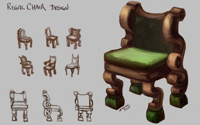
Regal Chair design


Starting out, a lot of the chairs were really rigid when I was sketching them. From there, I was really able to break out of the stocky shapes, which I was really glad about. 


Wednesday, January 3, 2018

Reign of Ice - Queen Crystallos' Scepter

Prop call out


Finding myself lacking in prop design work, I decided to take the Queen's scepter from my "Reign of Ice" project and create a prop design page.

For reference purposes, I made the top portion of the scepter due to how organic the shapes were. 

Originally, the design was something like this, but then I didn't like how similar the crystals looked in shape, so I changed it up. 

From there, I built up the scepter and adjusted along the way in terms of contrast and details.
In the end, due to the number of callouts, I decided to make a separate page for purely the callouts and textures. 


It was definitely a struggle to create the top wood piece of the scepter in Sculptris but it was worth the learning challenge. I was able to discover how to make shapes and pieces rather than faces. Eventually, I will try to learn how to lower the poly (triangle) count, haha.