I wanted to try changing my painting style to something more solid, less loose. A lot of my early paintings could be considered pretty muddy with the paint so I purposefully painted in flats and worked up from there.
The kitchen illustration was actually the first set of the three, where I focused on values and story telling. Going from there, I had a personal success with the Greenhouse, in the style. And the Study Room was a second test to repeat that same style.
Personally, I like the Greenhouse's results best; I feel like with the Study Room, the color palette was the best result out of it but I didn't get the same clean look I got from the Greenhouse piece.
Moving forward, I definitely plan on working on this style!
Greenhouse
Greenhouse - initial sketch
super messy thumbnails for Greenhouse composition
Kitchen - initial sketch
Kitchen - rough values
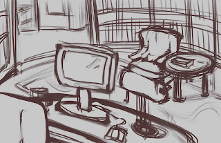
Study room - comp thumbs
Study room - initial sketch (rough)
Study room - sketch version 2 (cleaner)
Study room - rough paint in, pre version 2 sketch.
Study room


No comments:
Post a Comment