Saturday, September 15, 2018

Playing with a different style for environment drawings

I wanted to try changing my painting style to something more solid, less loose. A lot of my early paintings could be considered pretty muddy with the paint so I purposefully painted in flats and worked up from there. 
The kitchen illustration was actually the first set of the three, where I focused on values and story telling. Going from there, I had a personal success with the Greenhouse, in the style. And the Study Room was a second test to repeat that same style. 
Personally, I like the Greenhouse's results best; I feel like with the Study Room, the color palette was the best result out of it but I didn't get the same clean look I got from the Greenhouse piece. 
Moving forward, I definitely plan on working on this style!

Greenhouse 

Greenhouse - initial sketch 
super messy thumbnails for Greenhouse composition

Kitchen - initial sketch

Kitchen - rough values


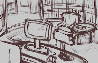
Study room  - comp thumbs


Study room - initial sketch (rough)

Study room - sketch version 2 (cleaner)

Study room - rough paint in, pre version 2 sketch.

Study room 


Monday, July 30, 2018

Vehicle and character design pairing


As a challenge prompt from a Facebook artists' group, I designed a character and vehicle. It was definitely something new where I had to consciously make something look damaged, as the prompt involved an escapee and their get away vehicle. 


For the character design, I wanted to challenge myself with making an armored character, and began sketching helmet designs. Once I found a couple I liked, I began working on the full character silhouette. 


The initial character sheet's layout started pretty much as above, with the character's illustration on the side. 

Eventually, I decided the back light beam was too much and took it off, and began working on the character's lighting. 

After taking away the line drawing underneath, and cleaning up some areas, I changed the layout after receiving some construct critiques on the model portion of the sheet, and hard edge indications. 

During these edits and changes, I was also working on the vehicle design along side the character, progressing at the same time. 


 There were tons of thumbs I went through as I was figuring out what to use as a design.


My idea was to have a small ship, one that wouldn't take a large crew to fly, especially since the character was escaping, and most likely had little to no time to get a crew.  Design wise, I also wanted the ship to hold some similarities to the character. The two tails on the back were part of that design. 


The damages I envisioned were from ramming into objects during the escape, with bullet holes from people trying to stop the character from escaping.  The main section that had the bullet holes was the cockpit area, as the guns were aimed at the character. Another area I thought about was the crew area, where the smaller windows were, but the windows were too small and might have made the holes unreadable. 


I then decided that the piece where the smaller windows were was too messy so I brought the paint back and thought about indents above that section of the ship. However, in the end, it didn't make sense with the shape of the ship, and I couldn't think of a logical way for the damage to end up there. 


Similarly, I scaled down some of the other damages on the ship, and cleaned up the orthographic drawing. 


Towards the end of this challenge, I caught myself more on the lack of hard edges when I was painting, which was good, now that I could catch myself on it. Going forward, I definitely need to use hard edges more, or at least, while I'm painting, jump back and forth from hard edges and soft. 


Friday, July 6, 2018

Market Street

Market Street


presentation sheet

There was an art challenge contest (THU 2018 Golden Ticket Challenge) going on, on ArtStation during most of the month of June, where artists had to create a painting of a parallel magical world of Malta.
I wanted to test myself, to see how much I could grow while participating in this challenge, and to see how I would paint a fantasy piece.

During the research and thumbnail phase, I had several ideas of what I wanted for the composition. Ideas ranged from knight statues guarding gates, rivers leading into the city, multiple bridges and towers. The latter idea eventually spawned into the current piece as I really liked how I could add a lot of range in the environment.
research notes and thumbs
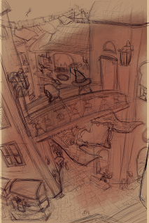
sketch on top of phone rough sketch

From there, I knew I wanted a warm color palette, something to add to the fun of the piece. 

flat colors

shadow and some lighting

building and building


I kept building and building the mini world I had created.
Eventually, after having hit a wall on what else I needed to work on, oh the down side of working on a piece for a while!, I asked in various social media artist groups for their opinions and received good critiques from a number of people.

(Before)  ---  Oh perspective fixes.--- (After) 

Hard edges and wonky perspective were the two main things I definitely found myself working on and correcting throughout the piece.

Punched up the values, added in the lighter values I was missing

Pushed back background to bring out foreground
I also got little bits of feedback that really helped me push the piece, such as missing the last 15-30% of lighter values in focal area, and pushing back the background to bring the foreground more into focus.

There were a ton more progress shots but for the sake of the people scrolling , I kept the images down to a minimum. Or at least I hope so!

All in all, I really improved in my painting skills and got to add another genre experience onto my belt.Now I just need to bring the knowledge in earlier into a piece, and try to cut down my finish time.
I had to take break the whole process into a lot of 3 hours sessions to keep my hand muscles from overwork/overuse, and to keep my laptop from heating up due to high temperatures while I was in Taiwan during the process.

Friday, June 1, 2018

Research Sub R2 (vehicle design)


presentation sheet with orthographic and some original thumbnails


This was the original thumbnail sketch I took and blew up to start filling up spaces. I added railings for stability once the sub returned to the main ship for docking. I also added many, many lights and windows. 

I told myself that if I wanted to have a cleaner painting, I needed to create a good line drawing. I still hate making a super clean line drawing since it always look stiff afterwards but I kept the lines as clean as possible before going back and filling in a flat value for the silhouette. 


From there, the purple background wasn't dark enough for me to see any loose paint lines so I filled in with a nearly black. (It's actually a really desaturated dark blue.)
And from there, once I filled in a solid single value for silhouette purposes, I started actually painting in the value differences while keeping things very desaturated and monochromatic to avoid going too crazy on colors early. I found at times, I tend to pick too many colors at once and it gets crazy quick. 


Once the solid values were in place, I started painting in shadow and light. After that, I started using the  soft light  blending mode for the brush and adding in colors to see what looked nice together. I wanted to keep yellow as a primary so I tried various oranges and purples but the purple I had picked looked odd for a submarine color scheme. I threw on the purple and then started playing with the Color Balance layer adjustment to find a good mix I wanted. I went towards a warm magenta orange-yellow balance. Once that was in place, I painted in the highlights and eventually wear and dirt/rust. 

It was a nice change of pace to actually draw the cleaner line, rather than my usual loose sketch - paint over method. I also separated the layers more than I would usually, something I started implementing during the #mermay art challenge drawings. It definitely helped keep things within the silhouette and also allowed me to keep each blending mode on its own which let me keep things organized in a different but helpful way. Particularly the soft light layer painting could be kept away from the overlays and the color dodge and extra highlights could be on their own. 


Monday, April 30, 2018

Mountain Cathedral


For this round's matte painting, I took a slightly different approach with the piece. In the Haven City matte painting, I had a rough value setup below the photos, and searched for pieces of the painting. In this piece, I found photos that worked with the idea of the piece, after having browsed through various saved pins on Pinterest, and threw them onto the canvas to see what I could do with them. 
The idea came to me after looking at saved pins of mountains before I thought about a What If scenario, of a cathedral up in the mountains, instead of a temple, which seemed pretty common in movies. 


Once I figured out placement, I began sketching in between, over and connecting the photos. 
None of the photos are mine so I can't take any credit for taking the photos. Unfortunately, I don't know who to credit for them either. 

Once the sketch lines were placed in, and I got a general idea of the piece, I started painting to fill in the gaps, before moving onto the cathedral. 

... then working on the bridge, hiker (which I also gathered photos for, though from Google). 
Obviously, without changing the hiker's details and pose, it would be a direct copy paste, which I wanted to avoid, for plagiarizing and taking other people's art (painting and photography). 
What you see above though, is not the original hiker image, since I already started changing details at this stage. 


Friday, April 27, 2018

Common Room - Teens of Valor environment design

Bloom lighting can be so pretty~

In the thumbnail stage, I told myself I really wanted to feature the kitchen bar counter piece more than the rest of the kitchen and show part of the living room space behind in the background. 
Another feature I really wanted to include was the staircase that didn't completely touch the floor. 

In the sketch portion, I decided to use multiple colors to help me see a bit better in my own drawing, especially since I started the sketch with everything as if it was transparent by drawing all sides of each object. 

The color stage was where I chose to paint differently. Usually I go right into painting very messy (well, not as clean at least), and include the shadows and lights on the same layer. This meant I would go straight away into painting and rendering. Thinking back now, I think this caused a lot of contrast-less paintings. 

To change that, I decided to make each shadow, secondary shadow, natural (or artificial) light , reflective light and bounce light, and bloom light on their own layers. 

It helped me adjust values better since I could go to the specific layer and change opacity or contrast on that layer and that layer alone. I think this method even let me get certain bounce color lighting better than I would if I had painted it in on the same layer, which helped me with this piece as I had colored transparent walls that needed a lot of bounce lighting. 


While stylistically, it's different than what I usually paint (no sketch lines, somewhat painterly style), it was a nice change of pace and I definitely want to see if I can incorporate it with my usual style. 
On Twitter, from one of the artists I follow, I saw some really lovely line work that I want to try to emulate for my own piece. The lines weren't like mine, where the lines were contrast and hard/harsh. The artist's lines were soft and sectioned; of course the said artist's style is watercolor so it complimented well. More experimenting ahead !