Showing posts with label thumbnails. Show all posts

Saturday, September 15, 2018

Playing with a different style for environment drawings

I wanted to try changing my painting style to something more solid, less loose. A lot of my early paintings could be considered pretty muddy with the paint so I purposefully painted in flats and worked up from there. 
The kitchen illustration was actually the first set of the three, where I focused on values and story telling. Going from there, I had a personal success with the Greenhouse, in the style. And the Study Room was a second test to repeat that same style. 
Personally, I like the Greenhouse's results best; I feel like with the Study Room, the color palette was the best result out of it but I didn't get the same clean look I got from the Greenhouse piece. 
Moving forward, I definitely plan on working on this style!

Greenhouse 

Greenhouse - initial sketch 
super messy thumbnails for Greenhouse composition

Kitchen - initial sketch

Kitchen - rough values


Study room  - comp thumbs


Study room - initial sketch (rough)

Study room - sketch version 2 (cleaner)

Study room - rough paint in, pre version 2 sketch.

Study room 


Monday, July 30, 2018

Vehicle and character design pairing


As a challenge prompt from a Facebook artists' group, I designed a character and vehicle. It was definitely something new where I had to consciously make something look damaged, as the prompt involved an escapee and their get away vehicle. 


For the character design, I wanted to challenge myself with making an armored character, and began sketching helmet designs. Once I found a couple I liked, I began working on the full character silhouette. 


The initial character sheet's layout started pretty much as above, with the character's illustration on the side. 

Eventually, I decided the back light beam was too much and took it off, and began working on the character's lighting. 

After taking away the line drawing underneath, and cleaning up some areas, I changed the layout after receiving some construct critiques on the model portion of the sheet, and hard edge indications. 

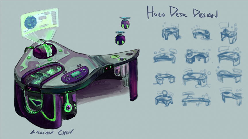
During these edits and changes, I was also working on the vehicle design along side the character, progressing at the same time. 


 There were tons of thumbs I went through as I was figuring out what to use as a design.


My idea was to have a small ship, one that wouldn't take a large crew to fly, especially since the character was escaping, and most likely had little to no time to get a crew.  Design wise, I also wanted the ship to hold some similarities to the character. The two tails on the back were part of that design. 


The damages I envisioned were from ramming into objects during the escape, with bullet holes from people trying to stop the character from escaping.  The main section that had the bullet holes was the cockpit area, as the guns were aimed at the character. Another area I thought about was the crew area, where the smaller windows were, but the windows were too small and might have made the holes unreadable. 


I then decided that the piece where the smaller windows were was too messy so I brought the paint back and thought about indents above that section of the ship. However, in the end, it didn't make sense with the shape of the ship, and I couldn't think of a logical way for the damage to end up there. 


Similarly, I scaled down some of the other damages on the ship, and cleaned up the orthographic drawing. 


Towards the end of this challenge, I caught myself more on the lack of hard edges when I was painting, which was good, now that I could catch myself on it. Going forward, I definitely need to use hard edges more, or at least, while I'm painting, jump back and forth from hard edges and soft. 


Friday, April 27, 2018

Common Room - Teens of Valor environment design

Bloom lighting can be so pretty~

In the thumbnail stage, I told myself I really wanted to feature the kitchen bar counter piece more than the rest of the kitchen and show part of the living room space behind in the background. 
Another feature I really wanted to include was the staircase that didn't completely touch the floor. 

In the sketch portion, I decided to use multiple colors to help me see a bit better in my own drawing, especially since I started the sketch with everything as if it was transparent by drawing all sides of each object. 

The color stage was where I chose to paint differently. Usually I go right into painting very messy (well, not as clean at least), and include the shadows and lights on the same layer. This meant I would go straight away into painting and rendering. Thinking back now, I think this caused a lot of contrast-less paintings. 

To change that, I decided to make each shadow, secondary shadow, natural (or artificial) light , reflective light and bounce light, and bloom light on their own layers. 

It helped me adjust values better since I could go to the specific layer and change opacity or contrast on that layer and that layer alone. I think this method even let me get certain bounce color lighting better than I would if I had painted it in on the same layer, which helped me with this piece as I had colored transparent walls that needed a lot of bounce lighting. 


While stylistically, it's different than what I usually paint (no sketch lines, somewhat painterly style), it was a nice change of pace and I definitely want to see if I can incorporate it with my usual style. 
On Twitter, from one of the artists I follow, I saw some really lovely line work that I want to try to emulate for my own piece. The lines weren't like mine, where the lines were contrast and hard/harsh. The artist's lines were soft and sectioned; of course the said artist's style is watercolor so it complimented well. More experimenting ahead !

Communications Room - Teens of Valor room design


composition thumbnails  as well as some prop thumbnailing/sketches
The initial sketch of the environment was rough at first before I went over the same sketch layer and thickened certain lines to indicate what was in front of the other lines. 
It's still not a clean line work; I've found myself never really liking the clean line art since it loses the feeling it had as a sketch.

When I first started adding in the colors, and adding in some of the material details on the glass top piece, I envisioned a clear glass piece, until I saw some photos on Pinterest that showed frosted glass pieces, from some glass staircases. This made me consider frosted glass, since if A) the glass piece was to be walkable, which the design was initially, the glass had to be thick enough not to crack under various weights. The staircase design I saw had two pieces of glass with extra piece of metal possibly in between the two, which looked a lot sturdier than one clear glass piece. 


After making that slight material change, I added in an orange rim light to most of the environment, which was casted from the orange computer screens and the hallway light on the far right of the image. Since the hallway light was farther, I made that orange a bit softer than compared to the computer screen light's rim lighting. 
Ultimately, as usual, I got rid of the sketch lines and started cleaning up the paint. 

Not long after, I started painting in lived in details, such as drinks, cans, opened snacks. However, even after adjusting the color balance and such, I still felt like I was missing lived in details. The piece wasn't as void as it was initially but the snacks and cans were very small differences in the environment. And since this Communications Room was a public space, I couldn't really just throw in clothes draped everywhere like you would see in a bedroom or a walk-in closet. 

While I did include some lived in details like empty cans and opened snacks, I found myself still wondering what else I could include to give the environment a lived in look. 

I even opted to study and try to create my own computer box designs.


However, in the end, I kept this piece a Work In Progress as I'm not satisfied with the result just yet. A reason I could be unhappy with the piece is how gray it looks (lack  of values, contrast). I'm considering adding in higher contrasts on shadows to really pop the lights from the computer screens and such. I may even throw in bloom lighting, which I only just recalled I could use as lighting in my pieces recently from an Apple APP Store "article". (Really, it was just a small story dubbed 'Love Letter to Bloom Light'.)


Tuesday, January 16, 2018

Holo Desk and Drone design


I wanted to completely redesign an old desk I drew for my comic, Teens of Valor, since I found the old drawing lackluster and not as sci-fi as I wanted. 

The first drawing is actually pretty close to the first thumbnail, which, looking back, had such an unappealing shape design to it. In effort to make the desk more sci and add unique shapes into the design, I spent quite a bit of time thumbnailing ideas. 

I got some neat silhouettes out of the thumbnail process and picked a few for presentation sake, before moving towards the sketch and linework phase.

When I got to the color phase, I realized I default to greys and blues often for sci-fi props, and subconsciously wondered if I was trying to work in gray scale. 
When the happy accident of adding dark purple to the colors occurred, I wondered, what if I made the color palette dark tones?

This lead me to consider the presented color palette. Story wise, for the comic, I'm a bit unsure about using darks for the props as it belongs to the heroes' headquarters, but who said darks had to be 'evil'? To combat this color correlation, I added in some pinks on the purple and tried using warmer colors for certain parts. 

All in all, it was pretty fun to see the progress the shapes took from thumbnail to thumbnail and I really had to think about why certain parts would go where. 
Also, I get to draw a prop design presentation for the drones from the desk! In hindsight, I wish I designed those first...


During the thumbnail stage, I went through a large page of thumbnails before figuring out features, placements and things such as stability. 


Friday, May 6, 2016

Oh it's been a while and so much to post!

By "so much" I mean weeks (months?) of paintings and drawings I haven't been posting here [on this blog] but I've been mostly posting on my site or Instagram , or queued up on my deviantART. Speaking of my site, I've recently discovered how much better, in my opinion, Wix is to Weebly. While there's still that free url name with the unavoidable extra /<name> , and lack of a file upload widget , excluding third party widgets, Wix has more presentation ("gallery") options for the images than Weebly does and social media links, excluding any third party plugins/widgets.

But I digress.  Basically,  I've been going around my social media and website and updating everywhere, well, ones that I already had. Since I've got too many images to upload here to catch up to the rest of my social medias and my site, I'll just post the more recent works and what I'm working on now project wise.

Futuristic vehicle design


Futuristic character designs

Both of these designs are working towards an environment piece: