Tuesday, September 30, 2014

Valley of Hope - WIP1


I literally started this out with splashing on different colors together to see if ,color palette wise, this would work. From there, I really had no clear plan of what I was going to paint. I became this mountain terrain and a person and clouds and some open area. 
I haven't decided fully on what kind of person the person will be so it's unrefined there. The lake will probably have a waterfall or some sort of downward flowing stream from it since I think that's how it's turning out in the image. I need to fix the mountains a bit more and add more background. I hope to get some textures in, either through image overlays or image referencing. 

Monday, September 29, 2014

Bat Reaper - actual final WIP


So near the end of last week, I posted a blog post with the process for the bat reaper character design. However, last night, I started thinking about painting over those lines I had from the line work. Therefore, today, I painted over those lines and, unless I want to add more, this will be the final WIP. 
It turns out I messed up on the hand while I was painting over the lines though so I repainted its left hand and adjusted brightness and contrast. 


Saturday, September 27, 2014

Character redesign WIP 4

Changed pose to make both feet standing on the ground .

Pushed his face shape and changed his hairstyle. 


Pushed her shape and made her shorter. 


Fixed some of the hands. 


Wednesday, September 24, 2014

Bat Repear - Character design


See my Behance page for more project details. 


Designing Tattoos that show who I am - WIP2


I've finished up the lines for the tattoos; in next week's class, I'd be coloring this in! 

Designing tattoos that show who I am - WIP1


They're larger than the minimum the instructor set for us but I'm liking how these are turning out so far! Sadly, I don't have enough time to finish the inking/line art part tonight with an early morning class tomorrow morning; I've only got the outline for all 3 and part of the inner lines for the first tattoo design done.

First tattoo is the gaming me; League of Legends, Steam, headphones, keyboard and my mouse.
The second tattoo is a mix of Taiwan and food loving me. The Chinese characters on the pot is "Taiwan".
The last tattoo is the DC-Marvel loving me. Batman was the first animated series I saw of the DC Universe and Spiderman was the first animated series I saw of the Marvel Universe. (Batman the Animated Series and Spiderman and his Amazing Friends, respectively.)  DC Comics is the first of the two I fell in love with before falling in love with Marvel, especially Marvel Cinematics Universe. Batman's costume is based off Batman the Animated Series costume while Spiderman, I believe is based off the Amazing Spiderman movies. It's the more recent of the Marvel movies , that had Spiderman, that I saw. A lot of personal symbolism within these icons, haha.

Tuesday, September 23, 2014

Creating depth of field with Photoshop

The last of the photo manipulation stuff in my Digital Media II class was today's in class exercise. I'm personally glad, since that means the rest of the semester is drawing!


The original image


Altered, lens blur with using channels to help Photoshop know what to blur/focus on. To help give the photo a toy model lighting look, color balancing the highlights to yellow and shadows to blue (midday sunlight), and pushing both brightness and contrast would do the trick. I personally forgot to boost the Brightness and Contrast but I think my original image had that going already so there wouldn't be much for me to boost. 


Saturday, September 20, 2014

Character redesign WIP 3

A lot of work this weekend pushing the shapes, correcting the construction and drawing expressions and turnarounds. 


Croc- Croc changed a lot from the original design. He's still a mechanical police shark but he looks more like a shark now, rather than a mix between a shark and sea otter. 


New version's lineup. Croc- Croc's a bit smaller than I would have preferred but all the characters are within the 5-6 head all range. 


Yep, I made silly faces to gather reference. 


The hair! Those were interesting to figure out in the different angles. 


Friday, September 19, 2014

Story composition thumbnail study

As part of a homework assignment for one of my classes, we were to do 20 story thumbnails ; 10 from a movie (or tv or cartoon) using the said source, and 10 from a fairy tale, using our imagination. 

I chose to do The Incredibles as my movie and Red Riding Hood  as my fairy tale. I had some issues with getting the wolf down right. How would a wolf realistically look, standing? Google Images was, to say the least, creepy, in helping me figure out some ideas. In the end, I scrapped the zoomed out view idea I had for the last fairy tale thumb since I just could not get the legs, or anatomy for that matter, of the wolf down right. 


Tuesday, September 16, 2014

Photoshop for its funny uses...

... such as human faces on animal heads!


I took a great horned owl and added my eyes, eyebrows, mouth and glasses onto the owl. I decided against hair on the owl that and/or we ran out of class time for me to do so. 

Apparently, there's such a thing as birds with arms, shark head horses, and bird headed dogs on the internet thanks to Photoshop. Look it up and prepare to laugh a lot! 

Saturday, September 13, 2014

Character re-redesign from well known story assignment

So I finally finished up the re-redesigns for the 3 of the 4 characters. The shapes that I wanted for the 3 stayed the same, except for Tinks, I made her more angular square shaped. I really hope I'm not told to start over again. Or at least get more critiques since my work was pretty much skipped right through with only 3 advices: "basically start over", "shapes are too similar except for this one" (croc-croc's) and "push shapes". Granted, the earlier work got too much time so towards the end of class, around 20-30 mins left, we still had 4-5 more people's work to go through. Mine was, I guess, similar in issues as other peoples' (push shapes, too similar) but I felt...gimped (?).

I don't know if I pushed it far enough; I did push it more than I did originally since I tried to go for a realistic approach. I'm still kinda going for a realistic approach with this but less realistic.

Rounder shape to match Peter's playfulness. 

Triangle for Hook's sharpness and villainy. Also added more references. 

Angular Square shape to represent her seriousness compared to Peter but not to the scale of villainy as Hook. Also added more references. 


Character Lineup 

Hopefully Croc Croc isn't too big compared to the other 3 characters. 

Thursday, September 11, 2014

"Basically start over"

There's nothing more disheartening and unhelpful as that, in my opinion. 
Those character redesigns that I did over the weekend were too similar in shape, aside from Croc-Croc the shark. But to hear "start over" on no one else's but mine? That really weighed my heart down enough where I felt the need to write these words down. 
I get that I needed to push the shapes more, especially from the other critiques from other classmates' assignments but different words could have been used. Heck just even saying "push the shapes more" and "these three characters are too similar" was fine! I could take those critiques without a problem but " start over" made my heart drop and most likely my face to fall. I know I shouldn't be invested into my work; I'd probably hear other disapproves when I work in the industry. Heck I even knew I needed to work on my characters! But "start over". Those words. 

Wednesday, September 10, 2014

Simple shape thumbnails


As part of an assignment, we needed to draw out composition thumbnails using simple shapes. For me, it was rather interesting since I usually don't abstract things when I digitally paint. The way I went around doing this was thinking of what shape I wanted the focal point and what tone I wanted to do the background in, since we are only allowed 4 tones, one of which had to be white. After putting down the focal point shape, I worked out from there. I don't know if that's a proper way to ever decide on a composition. Most of these thumbnails I really don't like or not sure if I would use them. I do have some nice ones, or so I believe. I guess I'll find out next class how the instructor feels about it, haha. 


Tuesday, September 9, 2014

Teens of Valor - Chapter 2 page 5


Apologies for the late upload! Since classes have started up again, I mentioned how delays were to be expected. 
On a different note, I tried using the marker brush in SAI for this page and I'm liking the combination of it with the oil pen brush. 
The last panel wasn't so fun without my usual pressure sensitivity since my tablet stopped working normally, again. Sigh.

 - - - 
I still hate how Manga Studio makes the image distorted and I have to force people to zoom in twice to read the dialogue. If I go with the option of increasing the font size, it ends up overtaking the drawings, which I don't want. I thought about using Photoshop but that means no word bubble options, or at least no premade ones. I suppose I could just draw them but I'm being a bit lazy I suppose. Maybe I'll try that method for next comic page. 

Added more to rough sketches of character redesign assignment

I decided that just line work (or rough line work in this case) wasn't enough and opted to pick color palettes for each of the 4 redesigned characters.
Croc Croc looks extra menacing now, in my opinion.
Tinks' color palette is definitely a work in progress. At the moment she shares a similar color palette to Peter Pangea's.


Monday, September 8, 2014

Loving oil based clay!

Though I still managed to get clay under my nails, I love how oil based clay doesn't need to be watered like water based clay needed. It's a lot less messy in my opinion too!
Plus it's so much softer ~ assuming it's been warmed up. And since my hands are usually warm, it works in my favor too, unlike water based which if I kept in my hand, it usually ends up dried...

Also fell in love with marker "brush" in SAI since I can shade without necessarily making a separate layer over the pen lines. This week's comic page, though late, will be me experimenting with that.

Saturday, September 6, 2014

Redesigning characters from well known stories

I can't think of a shorter title than this for the assignment I got from my Inspirational Art for Animation class.
The assignment, from how long we're spending on character design, is probably for 3 weeks? Or at least we're spending on  character design. But the entire assignment is our whole semester's project. I guess better wording would be, the character design portion would be for only part of the semester while background and environment would be the majority. At least that's how the lectures are going to end up like.


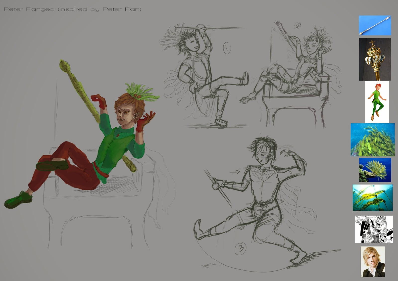
This week's assignment was to start researching, start writing up a summary of the story & character and get the shape sketches and character poses sketches done. As a class we picked 3 well known stories that everyone knew and redesign the characters answering the questions: when, where, genre, audience and.... there was one more question that I can't recall off the top of my head.

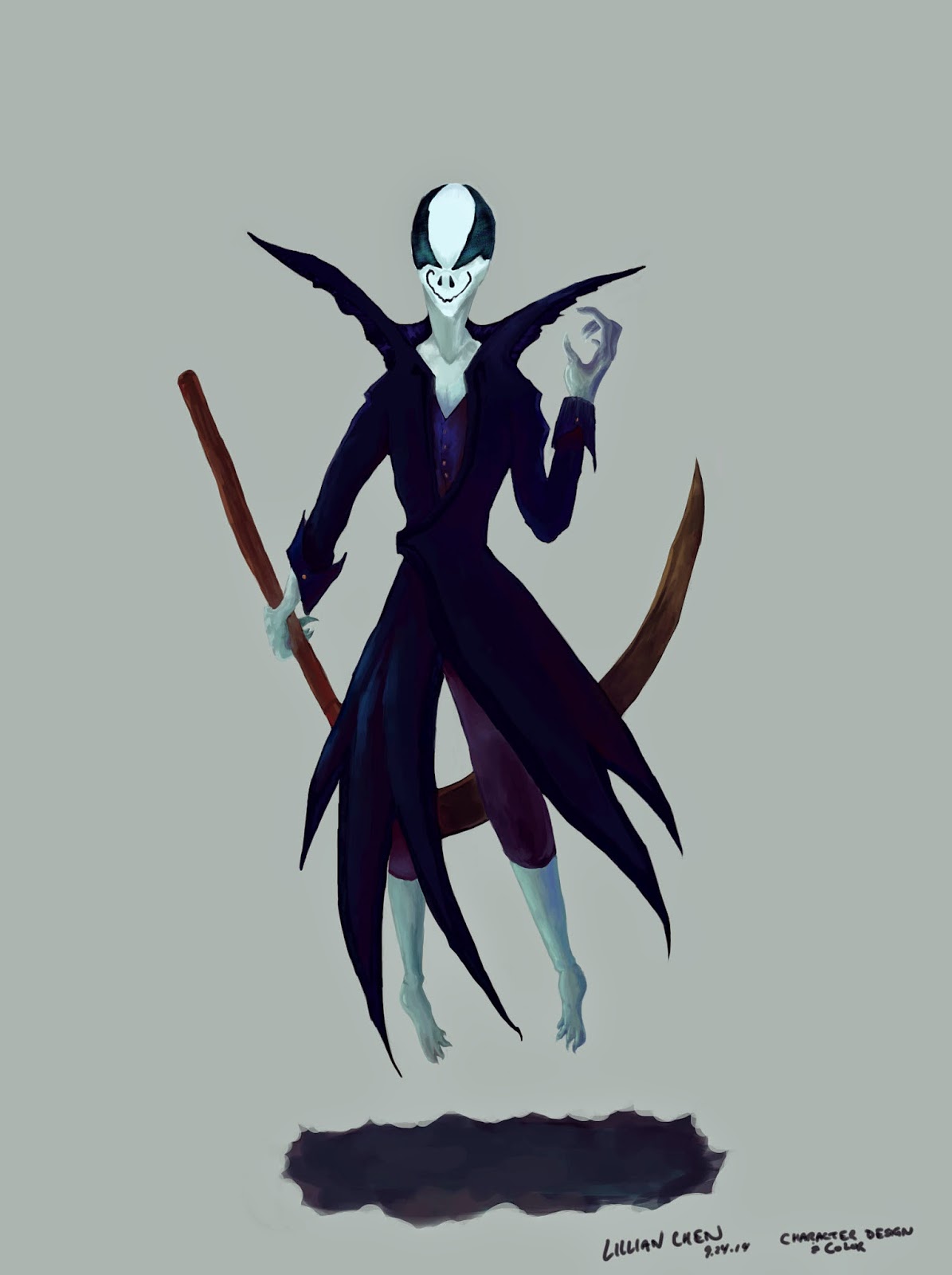
The story I picked from the 3 we were given was Peter Pan. I decided to place the story in the future, in an underwater city where its citizens are immortal thanks to a special gem. Keeping the idea of pirates, Hook is a pirate who wants to get his hands on the gem. Peter Pan is King Peter Pangea of the city, Foreverland. His secretary is Tinks Bellfish (inspired by Tinkerbell) and Tic Tock the crocodile is Croc-Croc, Foreverland's mechanical shark security, made by Pangea. Hook is the only one whose name didn't get altered, mostly because at the moment I don't have a better name for him...other than maybe Anchor. But that's horrible and not creative.


Thursday, September 4, 2014

Classes are starting back up for me..

With classes starting back up tomorrow, personal work will most likely be delayed. Once I figure out a working schedule and get a grasp on the workload as well, I can adjust my personal artwork schedule to fit between classes, classwork, meals and groceries.

I'm excited to see how much I can improve though and will definitely be posting up work from my classes on here.