Friday, December 29, 2017

Winter Holidays - paintings

It was near the holidays when I started these thumbnails.

From the thumbnails, I picked out 2 and worked up from there.

I wanted to paint a piece where the snow could be viewed from a window, but wanted to break away from a Western interior since I had sketched a similar window scene for Inktober.


I started out in a loose style in the thumbnails which transferred over to the larger painting. 
The dog and house weren't as designed as I liked so I did another pass over them. Then I realized just how large the dog was compared to the house, given the distance. (Yikes!)

I also fixed up the trees and snow since, in a realistic sense, with that much snow on the ground, the trees seemed a bit bare given their size.

I had a lot of fun painting both pieces for their styles as well as the snow. The tea house painting was a piece I really had to look up references for, which I'm glad for. I was really able to gather images for my reference library that way. The same can be said for the dog playing  in the snow piece.

Additionally, both pieces really helped me develop the habit of flipping canvases often, to the point where at times I'd forget which side was the correct side, haha! 

School Hall Fight


I wanted to retry my creative skills in designing a school hall environment painting again. The previous piece was interesting, story wise, where school kids were fighting against a robotic janitor gone rogue. There were a lot of fun details in that piece, but style wise, it really failed to catch the eye. Color choice played a part in there as well since that  piece was nearly all gray scale with only hints of blue and red. 

And so, came the idea of two super humans flying through the hall, now abandoned due to their fight. 


Before the final version, I realized how linear the flow seemed and I wanted to fix that.
Since I had planned for the girl to show off some supernatural abilities, it was a great way for me to draw the eye around the piece, and explain why papers were flying around in the air, haha.

I ultimately decided to get rid of the line work and go full painterly style, and cleaned up from there. 
I really do enjoy how it turned out stylistically and definitely wouldn't mind coming back to this style or even building on it. 


Rainy Days and cars - studies

To train my eye, I spend a few days doing studies. 

Sunburst Peak, Mt. Assiniboine - photo study

Girl Jumping Over 
The original photo I studied from had a different background, one I wasn't happy with so I opted to make my own, using SketchUp. 


Painting studies from photos of wet rainy streets in the city was a lot of fun where I got to really bring in a lot of color and try painting the streets with all those colors. 


After the rainy street studies, I wanted to try my hand at vehicle paintings. 

The first car was a learning curve with its reflections on the metal from the photo but it was still a learning experience and another painting to add to my art mileage. 

The next car went a bit better in getting the silhouette down better and it was a + 1 to my mileage. 

Particularly the painting with the girl jumping, I was able to incorporate SketchUp in creating backgrounds and really try to get certain shapes down in the city architecture. 

Swamp - House, Witch Doc and Gator


In repainting an older painting, I wanted to create asset pages for the house and characters. 

I wanted to properly design the house in the painting. 


Gator character design


Witch Doctor sketch, from this year's Inktober


I got to really try painting in a different style I usually would for both the characters and the house.
Additionally, I really got to design characters with animal influences without many the animal influence too apparent, which I really wanted to do in the original painting. 


Teens of Valor - Beam & Cogs character designs


Beam character design

Cogs character design

In resdesigning environments and vehicles/props for my comic, "Teens of Valor", I wanted to sketch out some other characters instead of the main character. 
These would be mainly secondary characters but each were unique and I wanted to give them love as well. 


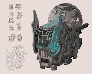
Teens of Valor - Tower

The Tower design was something I wanted to try my hand at, since most of the times I've been designing vehicles or space ships. The original design in my comic, "Teens of Valor", was a cylinder shape, and really bland. 


I'm glad I went ahead and tried to design a space tower. The design is a bit crazy I'll admit but it definitely got a unique silhouette, haha. 


Ship 20


Continuing with switching topics up, I wanted to paint a sci-fi spaceship.


Thumbnail sketches.

Constructing the ship


I really enjoyed designing and painting out the ship. I'm pretty happy with the end result as it looked finished and I could feel good adding it to my portfolio. 

There were plenty of good thumbnails I plan on painting out in the future, which is always a plus. 


"Teens of Valor" - Food Court

Taking an old idea (and painting), I wanted to design the Food Court into something more interesting with people and creatures around. The old design was an outside the food court - hallway view, which didn't allow me to really show the interior, and had empty tables everywhere. 

The thumbnail sketches ranged from the old, outside the door looking in view to stadium styled food court to multi-leveled food courts and eventually to a camera shot from the food tray area. 

In this one, I really wanted to make it a colorful, but not too crazy colorful, piece while showing off some characters interacting. 


I'm happy I got to show a more lived in environment such as the food court with actual characters in there, rather than just empty seats. Color wise, I think it turned out all right, though the yellow walls might be too contrasting to the purple floors. Maybe a more gray blue wallpaper , with a metal finish, or gloss finish would work.

"Teens of Valor" - Bunk


After painting many exterior environment pieces, I had to change things up for myself and paint an interior setting.

As part of my redesigning phase for my comic, "Teens of Valor", I designed one of the rooms in the Tower. Plenty of prop designs in this piece. I had a ton of fun with the closet design particularly. 

Starting out, I absolutely had to sketch out thumbnails since my usual first ideas for interior shots end up being similar. 

After the rough sketch, I started adding in colors to see what worked. I went with more feminine colors as the characters that would be in this room, would be two young girls. 

The design for the closet doors were an accidental design from when I was splashing on colors; I liked the random dark spots on the surface and saw the potential designs I could make from it. 


Looking back, the perspective is a bit odd as the horizon line is floating above the door for parts. 
I will definitely need to either, draw a line drawing with correct perspective, or flip the canvas more. I can't recall if I actually did flip the canvas often when I was painting this piece. 

Garden HQ


My goal for this project was to emulate background paintings in animes I see from time to time. 


I started out with sketching out the basic idea and building on top of it, and trying to fill in as many open spaces as I could. 


At this point in the painting stage, I felt like I needed to design more, to make this garden more my own. (Prop designing!)

After designing more of the garden, I saw I had to bump up the contrast. (Yay for eyes catching onto values in color now!)

While it wasn't quite the style I was going for, I do appreciate how it looked in the end and the bits I got to design while painting.