Showing posts with label Teens of Valor. Show all posts

Friday, April 27, 2018

Common Room - Teens of Valor environment design

Bloom lighting can be so pretty~

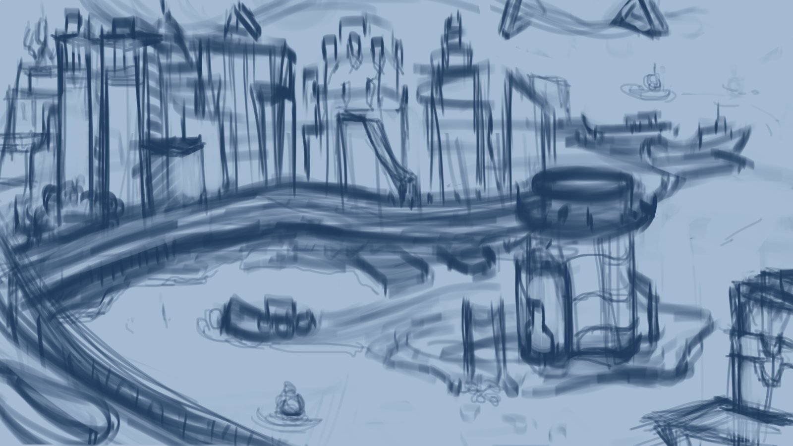
In the thumbnail stage, I told myself I really wanted to feature the kitchen bar counter piece more than the rest of the kitchen and show part of the living room space behind in the background. 
Another feature I really wanted to include was the staircase that didn't completely touch the floor. 

In the sketch portion, I decided to use multiple colors to help me see a bit better in my own drawing, especially since I started the sketch with everything as if it was transparent by drawing all sides of each object. 

The color stage was where I chose to paint differently. Usually I go right into painting very messy (well, not as clean at least), and include the shadows and lights on the same layer. This meant I would go straight away into painting and rendering. Thinking back now, I think this caused a lot of contrast-less paintings. 

To change that, I decided to make each shadow, secondary shadow, natural (or artificial) light , reflective light and bounce light, and bloom light on their own layers. 

It helped me adjust values better since I could go to the specific layer and change opacity or contrast on that layer and that layer alone. I think this method even let me get certain bounce color lighting better than I would if I had painted it in on the same layer, which helped me with this piece as I had colored transparent walls that needed a lot of bounce lighting. 


While stylistically, it's different than what I usually paint (no sketch lines, somewhat painterly style), it was a nice change of pace and I definitely want to see if I can incorporate it with my usual style. 
On Twitter, from one of the artists I follow, I saw some really lovely line work that I want to try to emulate for my own piece. The lines weren't like mine, where the lines were contrast and hard/harsh. The artist's lines were soft and sectioned; of course the said artist's style is watercolor so it complimented well. More experimenting ahead !

Communications Room - Teens of Valor room design


composition thumbnails  as well as some prop thumbnailing/sketches
The initial sketch of the environment was rough at first before I went over the same sketch layer and thickened certain lines to indicate what was in front of the other lines. 
It's still not a clean line work; I've found myself never really liking the clean line art since it loses the feeling it had as a sketch.

When I first started adding in the colors, and adding in some of the material details on the glass top piece, I envisioned a clear glass piece, until I saw some photos on Pinterest that showed frosted glass pieces, from some glass staircases. This made me consider frosted glass, since if A) the glass piece was to be walkable, which the design was initially, the glass had to be thick enough not to crack under various weights. The staircase design I saw had two pieces of glass with extra piece of metal possibly in between the two, which looked a lot sturdier than one clear glass piece. 


After making that slight material change, I added in an orange rim light to most of the environment, which was casted from the orange computer screens and the hallway light on the far right of the image. Since the hallway light was farther, I made that orange a bit softer than compared to the computer screen light's rim lighting. 
Ultimately, as usual, I got rid of the sketch lines and started cleaning up the paint. 

Not long after, I started painting in lived in details, such as drinks, cans, opened snacks. However, even after adjusting the color balance and such, I still felt like I was missing lived in details. The piece wasn't as void as it was initially but the snacks and cans were very small differences in the environment. And since this Communications Room was a public space, I couldn't really just throw in clothes draped everywhere like you would see in a bedroom or a walk-in closet. 

While I did include some lived in details like empty cans and opened snacks, I found myself still wondering what else I could include to give the environment a lived in look. 

I even opted to study and try to create my own computer box designs.


However, in the end, I kept this piece a Work In Progress as I'm not satisfied with the result just yet. A reason I could be unhappy with the piece is how gray it looks (lack  of values, contrast). I'm considering adding in higher contrasts on shadows to really pop the lights from the computer screens and such. I may even throw in bloom lighting, which I only just recalled I could use as lighting in my pieces recently from an Apple APP Store "article". (Really, it was just a small story dubbed 'Love Letter to Bloom Light'.)


Monday, March 26, 2018

Haven City & Harbor

Haven City & Harbor - matte painting
Matte paint  after adjustments 

after getting those details in, I started painting without the sketch lines and started working on shapes and smaller details

Brainstorming up comps and Haven Tower's details 

More tower details design sketches

Initial sketch before the tower details design sketch.
Initial rough value painting before tower details design sketch

Matte paint part 1 - (Really, more of a matte images paste and transform "spit" than "paint") 
Here the tower is the initial design 

Matte paint part  2 - The tower reflects the new design.

I realized in between the sketch and rough value painting, that the tower was rather lackluster with the city. Especially since the tower would be home to the comic's heroes and main character, it wasn't eye catching with the city. Because of that, I decided to sketch up more details and designs to see if I could think up some unique shapes while introducing some magic like elements.

The city, as well as the world so far, is part tech and part magic, so the initial tower wasn't enough magic. I then thought about floating protective pieces for the tower. After all, heroes usually get attacked by their enemies, right? It's what keeps stories interesting, conflict.
The protective pieces really let me include in magical elements while also keeping it somewhat techlike too. The idea was while these pieces also protect, the inner layer is also a tech based security system.

Going forward, I really need to let myself really design out the environment before I sketch and matte paint. Another note I need to tell myself is my sketch lines need to be a darker color so I can see it over the images I'm going to use to matte paint. I found myself having to toggle the textures and images a few times so I could see where city buildings would start and end on their edges.

Sunday, March 11, 2018

Workshop Bedroom - illustration

Illustrative piece based off of the isometric room I made (and later painted) from SketchUp

Painted room using SketchUp model as base (above)
said room from SketchUp (below)


With a rough sketch, and value paint over for lighting, I got the very basic idea down. 


From there, I applied color and some lighting but with little to no rendering.


As usual in my bigger painting projects, I got rid of the lines and painted up the shapes with some values and details. Eventually I decided the piece was too cool and adjusted the colors for a warmer look. I fidgeted a lot with saturation and value as I was working on this, before deciding I wanted to try again with matte painting, but on a small scale. Several textures went in, but nothing for large pieces, just a few machinery, few boxes and I was hand painting things again. Towards the end, I told myself I needed to bring the piece back to a consistency and put in textures for the floor, wall, cloth (ing), etc. 

It was a lot of back and forth and putting textures in, before painting over them again. This was definitely one of my larger PSD files, with the number of layers (40) I put in. Looking back, and moving forward, I realize I should put in textures and whatever I plan on using as a matte painting setup first, then do paint overs. The work method I used for this really was a lot of back and forth and made me feel like I was overworking this piece, which I might have actually.


Friday, March 9, 2018

Sparrow and Sparrow's Room

Sparrow's bedroom design

Sparrow's character design

Sketch using the SketchUp model as a base. 


Sketch of Sparrow's character design, before color

For the room design, I created the room shape (floor) first as a square before adding in the small closet space to break the stiffness (squareness) of the room design. 
The plan for this room design was to include the plants, mug and dragon sculpture I designed a while back. They're not as defined in the room painting as they were on their stand-alone prop sheet. 
It definitely was an fun experiment to paint a room in isometric. Fun enough that I decided to deign another room in isometric later.

I really went for loose sketching for the character design since I realized I start too quickly on details at times, loosing the line of action. 
I think I can call it a success in moving in the right direction since I was able to keep the sketch and design loose while only defining parts like the eyes, some of the folds and feet. The hands were kept a bit loose and simple, so going forward, I want to bring back some details into them. 


Saturday, January 20, 2018

Archway


As part of my redesigning of my comic, Teens of Valor, I sketched out a panel frame to figure out how I wanted to set a scene I was envisioning. The goal was to allow me to have both the scope of the room shown as the main character enters in the hall. 


Color wise, I could improve since the palette isn't as appealing as I'd like. There were a lot of muted colors to work with as I was using browns around the room so that probably played a part in the unappealing color palette. Browns with the gray purple-blue walls really don't mix well hahaa. My default of gray and blues came into play again for sci-fi. 

I tried playing with an orange hue mask, and a blue hue mask.

With the blue hue mask, the Earth hologram stayed the blue I envisioned but a lot of the other colors I had made for the other characters got lost. 


The orange hue mask helped pop the main character's red jacket, but it made the Earth hologram and machinery glows too evil looking. The other characters' colors also got lost in this hue mask. 

Regardless of which hue mask I choose, both have their pros and cons, but both do help unify the color palette. 

Tuesday, January 16, 2018

Holo Desk and Drone design


I wanted to completely redesign an old desk I drew for my comic, Teens of Valor, since I found the old drawing lackluster and not as sci-fi as I wanted. 

The first drawing is actually pretty close to the first thumbnail, which, looking back, had such an unappealing shape design to it. In effort to make the desk more sci and add unique shapes into the design, I spent quite a bit of time thumbnailing ideas. 

I got some neat silhouettes out of the thumbnail process and picked a few for presentation sake, before moving towards the sketch and linework phase.

When I got to the color phase, I realized I default to greys and blues often for sci-fi props, and subconsciously wondered if I was trying to work in gray scale. 
When the happy accident of adding dark purple to the colors occurred, I wondered, what if I made the color palette dark tones?

This lead me to consider the presented color palette. Story wise, for the comic, I'm a bit unsure about using darks for the props as it belongs to the heroes' headquarters, but who said darks had to be 'evil'? To combat this color correlation, I added in some pinks on the purple and tried using warmer colors for certain parts. 

All in all, it was pretty fun to see the progress the shapes took from thumbnail to thumbnail and I really had to think about why certain parts would go where. 
Also, I get to draw a prop design presentation for the drones from the desk! In hindsight, I wish I designed those first...


During the thumbnail stage, I went through a large page of thumbnails before figuring out features, placements and things such as stability.