Monday, April 30, 2018

Mountain Cathedral


For this round's matte painting, I took a slightly different approach with the piece. In the Haven City matte painting, I had a rough value setup below the photos, and searched for pieces of the painting. In this piece, I found photos that worked with the idea of the piece, after having browsed through various saved pins on Pinterest, and threw them onto the canvas to see what I could do with them. 
The idea came to me after looking at saved pins of mountains before I thought about a What If scenario, of a cathedral up in the mountains, instead of a temple, which seemed pretty common in movies. 


Once I figured out placement, I began sketching in between, over and connecting the photos. 
None of the photos are mine so I can't take any credit for taking the photos. Unfortunately, I don't know who to credit for them either. 

Once the sketch lines were placed in, and I got a general idea of the piece, I started painting to fill in the gaps, before moving onto the cathedral. 

... then working on the bridge, hiker (which I also gathered photos for, though from Google). 
Obviously, without changing the hiker's details and pose, it would be a direct copy paste, which I wanted to avoid, for plagiarizing and taking other people's art (painting and photography). 
What you see above though, is not the original hiker image, since I already started changing details at this stage. 


Friday, April 27, 2018

Common Room - Teens of Valor environment design

Bloom lighting can be so pretty~

In the thumbnail stage, I told myself I really wanted to feature the kitchen bar counter piece more than the rest of the kitchen and show part of the living room space behind in the background. 
Another feature I really wanted to include was the staircase that didn't completely touch the floor. 

In the sketch portion, I decided to use multiple colors to help me see a bit better in my own drawing, especially since I started the sketch with everything as if it was transparent by drawing all sides of each object. 

The color stage was where I chose to paint differently. Usually I go right into painting very messy (well, not as clean at least), and include the shadows and lights on the same layer. This meant I would go straight away into painting and rendering. Thinking back now, I think this caused a lot of contrast-less paintings. 

To change that, I decided to make each shadow, secondary shadow, natural (or artificial) light , reflective light and bounce light, and bloom light on their own layers. 

It helped me adjust values better since I could go to the specific layer and change opacity or contrast on that layer and that layer alone. I think this method even let me get certain bounce color lighting better than I would if I had painted it in on the same layer, which helped me with this piece as I had colored transparent walls that needed a lot of bounce lighting. 


While stylistically, it's different than what I usually paint (no sketch lines, somewhat painterly style), it was a nice change of pace and I definitely want to see if I can incorporate it with my usual style. 
On Twitter, from one of the artists I follow, I saw some really lovely line work that I want to try to emulate for my own piece. The lines weren't like mine, where the lines were contrast and hard/harsh. The artist's lines were soft and sectioned; of course the said artist's style is watercolor so it complimented well. More experimenting ahead !

Communications Room - Teens of Valor room design


composition thumbnails  as well as some prop thumbnailing/sketches
The initial sketch of the environment was rough at first before I went over the same sketch layer and thickened certain lines to indicate what was in front of the other lines. 
It's still not a clean line work; I've found myself never really liking the clean line art since it loses the feeling it had as a sketch.

When I first started adding in the colors, and adding in some of the material details on the glass top piece, I envisioned a clear glass piece, until I saw some photos on Pinterest that showed frosted glass pieces, from some glass staircases. This made me consider frosted glass, since if A) the glass piece was to be walkable, which the design was initially, the glass had to be thick enough not to crack under various weights. The staircase design I saw had two pieces of glass with extra piece of metal possibly in between the two, which looked a lot sturdier than one clear glass piece. 


After making that slight material change, I added in an orange rim light to most of the environment, which was casted from the orange computer screens and the hallway light on the far right of the image. Since the hallway light was farther, I made that orange a bit softer than compared to the computer screen light's rim lighting. 
Ultimately, as usual, I got rid of the sketch lines and started cleaning up the paint. 

Not long after, I started painting in lived in details, such as drinks, cans, opened snacks. However, even after adjusting the color balance and such, I still felt like I was missing lived in details. The piece wasn't as void as it was initially but the snacks and cans were very small differences in the environment. And since this Communications Room was a public space, I couldn't really just throw in clothes draped everywhere like you would see in a bedroom or a walk-in closet. 

While I did include some lived in details like empty cans and opened snacks, I found myself still wondering what else I could include to give the environment a lived in look. 

I even opted to study and try to create my own computer box designs.


However, in the end, I kept this piece a Work In Progress as I'm not satisfied with the result just yet. A reason I could be unhappy with the piece is how gray it looks (lack  of values, contrast). I'm considering adding in higher contrasts on shadows to really pop the lights from the computer screens and such. I may even throw in bloom lighting, which I only just recalled I could use as lighting in my pieces recently from an Apple APP Store "article". (Really, it was just a small story dubbed 'Love Letter to Bloom Light'.)


Monday, March 26, 2018

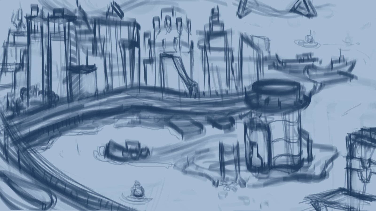
Haven City & Harbor

Haven City & Harbor - matte painting
Matte paint  after adjustments 

after getting those details in, I started painting without the sketch lines and started working on shapes and smaller details

Brainstorming up comps and Haven Tower's details 

More tower details design sketches

Initial sketch before the tower details design sketch.
Initial rough value painting before tower details design sketch

Matte paint part 1 - (Really, more of a matte images paste and transform "spit" than "paint") 
Here the tower is the initial design 

Matte paint part  2 - The tower reflects the new design.

I realized in between the sketch and rough value painting, that the tower was rather lackluster with the city. Especially since the tower would be home to the comic's heroes and main character, it wasn't eye catching with the city. Because of that, I decided to sketch up more details and designs to see if I could think up some unique shapes while introducing some magic like elements.

The city, as well as the world so far, is part tech and part magic, so the initial tower wasn't enough magic. I then thought about floating protective pieces for the tower. After all, heroes usually get attacked by their enemies, right? It's what keeps stories interesting, conflict.
The protective pieces really let me include in magical elements while also keeping it somewhat techlike too. The idea was while these pieces also protect, the inner layer is also a tech based security system.

Going forward, I really need to let myself really design out the environment before I sketch and matte paint. Another note I need to tell myself is my sketch lines need to be a darker color so I can see it over the images I'm going to use to matte paint. I found myself having to toggle the textures and images a few times so I could see where city buildings would start and end on their edges.

Saturday, March 24, 2018

Dragon Cave, Dragon creature sheet


Dragon creature design as part of a monthly challenge from Character Design Challenge's Facebook page. 
The challenge itself requires a full body image, rather than the illustration version I have as the first image but I wanted to use this challenge as an experiment with matte painting. As a result, I painted two images, one for an experiment with matte painting, the other for the challenge. 


Designing a dragon, specifically a western dragon, was a new route for me. Typically when I draw dragons, they're of an eastern influence and usually lack the wings of a western dragon. 
It was pretty fun to look at a bunch of animal influences to create a look for the dragon. 
Some animals I looked at were snapping turtles, lizards, komodo dragons, bats, and sharks.


Once I did get the design in place, I sketched up a composition and began adding value and lighting, before placing various textures and images on top.
I definitely wanted the dragon to look scary so a low key palette with sharp contrasts was what I had in mind.

During the painting process, I kept adding more shadows so I could increase the contrast and give the appearance of the dragon emerging from shadow, with the light casted from the fire. 

After completing the illustration, I moved onto the character (creature) design sheet.

I took the sketch from the illustration and built upon it, to save me some time in the sketching.
Unlike the illustration, where I put grayscale values before the images and textures, for this I went with color first before textures. 

I had to remind myself during the color stage to not go full render as I still have textures to add. Once those textures were mostly in, I did paint overs on those textures to help mess with the body and features.

Since my plan was to make this a character (creature) design sheet, I needed details and callouts. So I began sketching out an ortho of the head and then finally the wings. I decided to keep the focus on the dragon, so I took out the flat colors I had for the callouts and kept the sketches somewhat loose. 

All in all, it was a fun challenge and lesson with matte painting and creature (dragon) design. I got to try my hand at two things in one painting (two if you count the sheet and illustration as separates). 

Sunday, March 11, 2018

Workshop Bedroom - illustration

Illustrative piece based off of the isometric room I made (and later painted) from SketchUp

Painted room using SketchUp model as base (above)
said room from SketchUp (below)


With a rough sketch, and value paint over for lighting, I got the very basic idea down. 


From there, I applied color and some lighting but with little to no rendering.


As usual in my bigger painting projects, I got rid of the lines and painted up the shapes with some values and details. Eventually I decided the piece was too cool and adjusted the colors for a warmer look. I fidgeted a lot with saturation and value as I was working on this, before deciding I wanted to try again with matte painting, but on a small scale. Several textures went in, but nothing for large pieces, just a few machinery, few boxes and I was hand painting things again. Towards the end, I told myself I needed to bring the piece back to a consistency and put in textures for the floor, wall, cloth (ing), etc. 

It was a lot of back and forth and putting textures in, before painting over them again. This was definitely one of my larger PSD files, with the number of layers (40) I put in. Looking back, and moving forward, I realize I should put in textures and whatever I plan on using as a matte painting setup first, then do paint overs. The work method I used for this really was a lot of back and forth and made me feel like I was overworking this piece, which I might have actually.